Eight years ago, I designed a button that was bright red.
Not just any red—a specific hex code: #FF3B30. Apple's system red. It was beautiful. It was urgent. It converted at 18% higher than the blue version. I was proud of that button.
I didn't think about the color science behind it. I just knew it worked.
Now I keep my phone in permanent grayscale. And I can tell you exactly why that red button worked—and why you should consider turning the color off entirely.
The Biology of Attention
Here's something they don't teach you in most design schools: color is not a visual phenomenon. It's a survival mechanism.
Our eyes evolved to detect color for one primary reason: finding things. Ripe fruit against green leaves. Predators in tall grass. A red berry that might be poisonous. Color vision is an early warning system. It tells your brain: "Look here. This matters."
That's not a metaphor. It's hardwired into your visual cortex.
When you see a red notification badge, your brain doesn't think "oh, a color." It triggers an orienting response—the same one that would activate if something moved in your peripheral vision. Your attention shifts automatically. You don't choose to look. You just look.
This is called "bottom-up attention." It's involuntary. It's pre-conscious. It's the reason you can't ignore a bright notification even when you're trying to focus. Your brain is doing exactly what it evolved to do: prioritizing visual anomalies.
And your phone is full of them.
The Color Engineering of Your Phone
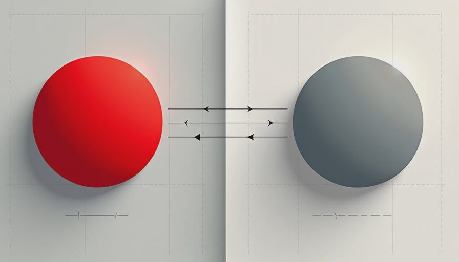
Now look at your home screen.
Every app icon is a carefully designed color signal. Blue for calm/trust (Facebook, Twitter/X). Green for go/positive (WhatsApp, Messages). Yellow for warmth/attention (Snapchat). Red for urgency/danger (YouTube, Gmail).
These aren't accidents. They're color psychology, applied at scale. Each icon is competing for your visual attention. And the phone itself—the operating system—adds another layer: the red badge. That little number in a circle. It's not just a notification—it's a color-anchored urgency signal that your brain cannot ignore.
The phone manufacturers know this. The screen technology is designed to maximize color saturation. Brightness, contrast, vibrancy—all tuned to make those icons as visually arresting as possible.
Your phone is engineered to compete for your attention using the same biology that kept our ancestors alive.
What I Did—and What I Learned
Two years ago, I turned my phone to grayscale. It's a hidden setting on both iOS and Android. Three taps and color is gone.
Here's what happened.
Week 1: The Dullness
The first thing I noticed: my phone looked boring. Unappealing. Like an old newspaper.
I didn't want to look at it. And that was exactly the point.
The visual allure was gone. The red badges didn't pop. The blue icons didn't feel calming—they just felt grey. My phone stopped being something I wanted to pick up just to look at.
My screen time dropped by 40% in the first week. Not because I tried harder. Because the phone was less attractive.
Month 1: The Disorientation
After a few weeks, something unexpected happened: I started noticing color in the real world again.
Sunset. Green leaves. The yellow of a taxi. My friend's blue eyes. They seemed more vivid than I remembered. Because my phone had been desensitizing me to real color—flooding my visual system with artificial saturation so constantly that the real world felt comparatively dull.
Grayscale inverted that. My phone became the dull thing. The world became the vibrant thing.
Year 2: The Habit
Now, I barely notice it. Grayscale is just how my phone looks. I don't miss color on apps. I don't feel like I'm missing out. The phone is a tool—not a visual experience.
But I do notice when someone hands me their phone. The colors seem garish. Overwhelming. I can't focus on the content because my attention is being pulled in every direction by the visual noise.
That's when I realized: color on a phone isn't a feature. It's a distraction.
The Science Behind It
This isn't just personal experience. There's research.
Studies on visual attention show that color is one of the most powerful "bottom-up" attention grabbers. It bypasses your conscious control. It doesn't matter how disciplined you are—if something is brightly colored, your brain will process it before you decide to look.
In a well-known study, participants were asked to ignore red stimuli while searching for targets. They couldn't. The red items captured attention automatically, even when participants knew they were irrelevant.
You cannot filter out color. It enters your visual system before your conscious mind has a say.
The notification badge on your phone isn't just a red circle. It's a biological exploit. It uses your ancient survival circuitry to interrupt whatever you're doing—because your brain is wired to treat red as important.
This is the same mechanism slot machines use. The flashing lights. The bright colors. It's not entertainment—it's neurological manipulation.
What Grayscale Actually Does
Let me clear up a common misconception: grayscale doesn't make you less distracted. It makes you less distractible.
The difference matters.
"Less distracted" means you have more willpower. You try harder to focus. "Less distractible" means there's less trying—the distractions themselves are less effective.
When your screen is grayscale, the visual hierarchy collapses. Everything is the same tone. Nothing stands out. The red badge, the blue icon, the green button—they all look the same. Your brain stops treating them as urgent.
You don't have to resist the impulse to check. The impulse doesn't appear as strongly.
That's the gift of grayscale. It doesn't require discipline. It just changes the stimulus.
A Quick Note on Design
Here's an irony I have to admit.
I used color to grab attention in my apps because it worked. I knew it worked because I A/B tested it. The colorful button got more clicks. The red notification got more opens. The blue card got more engagement.
But I never asked: "Is this good for the user?"
I asked: "Does this get the user to do what we want?"
Grayscale is the user's defense against that question. It takes back control. When color is gone, the only thing that remains is value. Does the app actually serve you, or was it just visually persuasive?
Should You Try It?
Yes. For a week at least. Here's how:
On iOS: Settings → Accessibility → Display & Text Size → Color Filters → Grayscale.
On Android: Settings → Accessibility → Color Correction → Grayscale.
Turn it on. Leave it on. Don't cheat.
What you'll notice: the first few days feel weird. Your phone seems broken. You'll want to turn it back. Don't.
After a week, turn it off for an hour. The colors will feel like a assault. You'll see all the places your attention was being stolen without your consent.
You might not keep it on forever. But you'll never look at your screen the same way again.
You need less than you think. Sometimes the most vivid colors are the ones you see when you stop looking at your screen.