Two years ago I turned my phone grayscale and never turned the color back on.
It was not a dramatic decision. I was testing a small interface change that research suggested could reduce compulsive checking. I expected to last a few weeks. The experiment quietly became permanent.
Why Color Matters More Than We Notice
Color is one of the strongest attention cues a screen has. Red badges, saturated icons, bright photos, and the occasional flash of a notification all use hue to pull the eye. When those signals disappear, the phone becomes visually quieter. The same information is still there—messages, maps, calendars, cameras—but it arrives without the same urgency.
I had spent years designing interfaces that relied on color to create hierarchy and urgency. Turning it off on my own device was a way of removing one of the levers I knew worked too well.
What Actually Changed
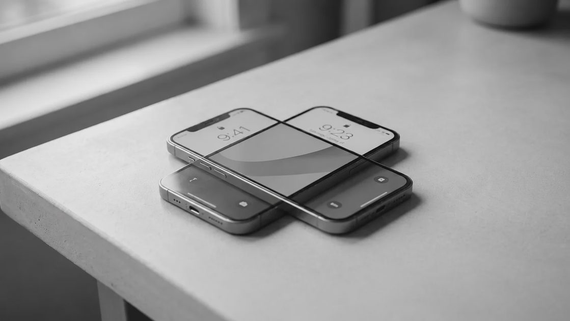
The first week felt strange. App icons that once stood out now blended together. Photos looked muted. The home screen lost its visual energy. My thumb still reached for the same apps, but the pull was slightly weaker.
After about ten days the strangeness faded. Checking the phone became a more deliberate act. I opened it when I needed something specific rather than when a flash of color caught my peripheral vision. The difference was not massive, but it was consistent. Over months it compounded.
I still use the same core apps. I still take photos. I still get messages. The phone simply stopped announcing itself as aggressively.
What I Actually Miss
Very little of what I expected.
I miss color in two narrow situations. First, when I need to quickly identify a specific app icon in a folder—grayscale removes some of the visual shortcuts. Second, when I am looking at certain photos or maps where color carries real information (traffic layers, for example). Both are minor and solvable by opening the image or temporarily enabling color if needed.
I do not miss the red notification badges. I do not miss the saturated social feeds. I do not miss the way a brightly lit screen used to feel more “alive” than the room around it.
What I Do Not Miss
The constant low-level visual stimulation. The way a colorful home screen could pull my attention even when I had no particular reason to look. The subtle sense that the phone was always slightly more interesting than whatever else was happening.
Color is not neutral. On a device designed to be checked frequently, it functions as a persistent invitation. Removing it does not make the phone useless. It makes the invitation quieter.
How to Try It
On iPhone: Settings → Accessibility → Display & Text Size → Color Filters → turn on Grayscale.
On most Android phones the path is similar under Accessibility or Display settings.
You can leave it on permanently or set a schedule. I leave it on all the time. The camera still records in full color; only the interface is desaturated. When I want to look at a photo properly, I open it and the color is there.
The change takes almost no effort and requires no new apps, no subscriptions, and no public declaration. It is one of the highest-leverage, lowest-cost adjustments available.
Two Years Later
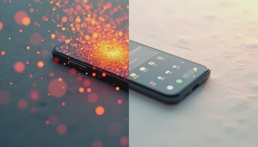
I still carry a phone. I still design digital products. I still check messages and maps and the weather. The difference is that the device no longer uses one of its most effective attention tools against me.
Grayscale did not solve every problem of digital distraction. It simply removed one reliable mechanism. That has been enough to keep it on.
You need less than you think. Sometimes the least dramatic change is the one that lasts.