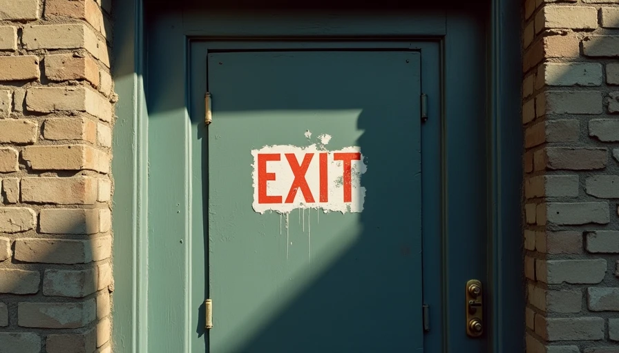
I designed a button that boosted subscription retention by 22%. It was the proudest line on my resume. The product director praised it in the quarterly review, the team toasted with champagne, and I featured it prominently in my portfolio. I even talked it up in my next job interview.
Two years later, I realised what that button really was.
It was a carefully laid trap. And I was the one who dug it.
What Are Dark Patterns?
You've probably heard the term—design tricks that nudge users into doing things they didn't intend to do. Fake scarcity, hidden cancel buttons, guilt‑trip pop‑ups, confusing opt‑outs.
But inside the industry, we never called them that. In designer Slack channels, they were "growth tactics" or "conversion optimisation." On dashboards, they were "user lifetime value improvements."
We never used the word "deception," because we didn't think we were deceiving anyone.
Every tech company has its own data mantra. Google had "user‑centric." Facebook had "move fast and break things." Ours was "friction reduction"—a phrase that sounded almost virtuous. In practice, it meant: if your first instinct was to cancel, we'd hide the cancel button. Not remove it—that would be illegal—but make it grey, small, buried three menus deep, and preceded by "Are you sure you want to miss out on all this great content?"
We didn't remove the option. We just made it painful. And pain, most users don't persist through.
Three "Growth Tactics" I Built
Let me be honest about three things I personally shipped. Not some anonymous team—me.
1. The "Only 3 Spots Left" Lie
I designed a payment page for an online course. The backend had a "stock warning" trigger: if a user hesitated for more than 30 seconds, a live‑looking message popped up: "Only 3 spots left, 12 people are viewing right now."
In reality, the course had unlimited capacity. "Only 3" was fake. "12 people viewing" was fake. Only one number was real: that message lifted conversion by 34%.
At the time, the product manager said, "Competitive pressure is an effective decision driver." I nodded along. Yes, it was effective. But it was also false. I invented scarcity out of thin air and used the user's anxiety to push a purchase they probably didn't need.
How did I justify it? I told myself it was "standard marketing, everyone does it." That sounds exactly like a student caught cheating saying, "The whole class copied."
2. The Cancellation Maze
I designed a six‑step cancellation flow for a subscription service. A standard cancel takes three steps—we stretched it to six:
Step 1: Click "Cancel."
Step 2: Pick a reason from a drop‑down (seven options).
Step 3: A pop‑up: "Are you sure? We'd be sad to see you go."
Step 4: An alternative: "How about pausing for a month?"
Step 5: Another alternative: "Or downgrade to a cheaper plan?"
Step 6: Final confirmation—but the "Confirm Cancel" button was grey, while the "Keep Using" button was bright blue.
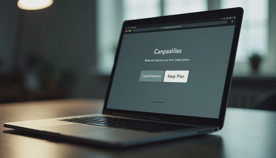
Human vision is naturally drawn to high‑contrast, saturated objects. I exploited a basic principle of human biology to make users more likely to press the wrong button.
Result? The drop‑off rate—users who started cancellation but didn't finish—jumped from 12% to 41%. One out of every three people who wanted to leave got stuck. Not because they changed their minds. Because I made the door hard to push open.
3. The Free Trial Default Trap
Free trials look simple: try it for 7 days, then auto‑convert to paid.
But we put a small grey line under the sign‑up button: "Auto‑renews after 7 days, cancel anytime." We placed it at the bottom, four font sizes smaller, nearly blending into the background.
Users thought they were just "trying." In reality, they were locked into a recurring billing cycle. A charge they probably wouldn't notice until they checked their statement months later and asked, "How long have I been paying for this?"
I designed that grey small text. I chose that font size. I knew exactly what it did.
How We Justified It
If you'd asked me three years ago, "Aren't you manipulating users?" I'd have given you a bulletproof answer:
"I'm optimising conversion efficiency. Every business does this. Users are adults—they have a choice."
That's the most terrifying thing about dark patterns: the people who design them don't think they're villains. We had an entire toolkit of rationalisations:
A/B tests showed this version "performed better"—we never asked "better for whom."
Data‑driven decisions—if conversion was up, it was good.
Everyone else does it—we'd fall behind competitively.
Users have a choice—I just made one option more prominent and another less so.
None of those hold up. A/B tests tell you what works, not what's right. And as for "users have a choice"—when I hid the cancel button, that wasn't a choice. That was an obstacle course.
A choice you have to run an obstacle course to make isn't a real choice.
The Turning Point: A Small Thing
What changed me wasn't some grand epiphany. It was a small thing.
One day I was running a user test. A woman in her fifties—not a tech person, just a regular user—was trying to cancel our product. She clicked three times and couldn't find the option. The screen popped up: "Are you sure you want to give up all this great content?" She paused, then quietly asked:
"I'm not giving up anything. I just don't need it anymore."
She put down the mouse and turned to me: "Is it me? Am I not good with computers?"
I said, "No, it's our design."
That moment I realised: I had turned "users aren't good with computers" into a business strategy. If someone was confused by our interface, that wasn't their fault—it was mine. And I'd chosen not to fix it, because their confusion kept another subscription fee coming in.
Before that day, I was a "conversion optimisation expert." After that day, I started looking at my portfolio and asking for the first time: "What was I actually doing?"

Why I Won't Do It Again
I don't design dark patterns anymore. Not because I'm suddenly a better person—but because I no longer need to lie to myself.
Dark patterns exist because of a deeper fear: we don't trust that our product is good enough for users to stay voluntarily. So we need traps, misdirection, fatigue tactics.
You only hide the exit when you don't believe users would choose you.
Open any app on your phone right now. Go through its cancellation flow. Can you find it in three steps? Is the button as clear and easy as the sign‑up button?
If not, you know who designed it.
We used to be colleagues.
Three Things You Can Do
One, read the cancel flow. Next time you unsubscribe from something, count the steps. Ask at each step: "Is this helping me decide, or is it trying to tire me out?"
Two, don't click "Only X left." It's probably not true. And even if it is, scarcity is a sales tactic, not a decision criterion.
Three, remember: you're not "bad with tech." If an interface confuses you, if you can't find the exit, if you accidentally click something you didn't want—that's not you. That's the design. It was made that way on purpose.
You need less than you think. If a company has to hide the exit door, it doesn't deserve your stay.